Ever wondered why some logos stick in your mind forever while others fade faster than last year’s fashion trends? Welcome to the fascinating world of logo design evolution, where shapes, colors, and clever tweaks shape our perception of brands every day.
From ancient symbols to modern minimalism, logos have come a long way. So, grab your favorite drink and let’s explore how brands transform their logos to stay fresh, relevant, and unforgettable.
A Quick Trip Down Logo Memory Lane
Before we jump into trends and redesigns, let’s rewind a bit. Logos have existed since humans felt the urge to mark things as theirs. Ancient Egyptians branded livestock. Craftsmen stamped pottery. Royal families flaunted coats of arms.
Fast forward to the Industrial Revolution and boom! Mass production demanded that brands stand out. Suddenly, a simple mark on a crate or bottle wasn’t just practical; it became part of a brand’s identity.
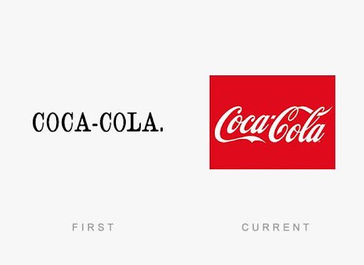
The early 20th century birthed the golden age of logo design. Think of Coca-Cola’s flowing script or Ford’s iconic oval. These weren’t just images; they were promises of quality and consistency.
Why Logos Change: The Need for a Makeover
If it ain’t broke, don’t fix it… right? Well, not quite when it comes to logos. Brands update their logos for plenty of reasons:
- Staying modern: Trends change. What looked futuristic in the 80s might scream ‘outdated’ today.
- Mergers and expansions: New markets, new customers, time for a fresh face!
- Bad press or rebranding: Sometimes a brand needs a clean slate.
- Digital-first world: Logos must look good on a billboard and a tiny app icon.
Take Google, for example. Its logo has evolved subtly but smartly, dropping shadows and fancy fonts for clean lines that scale perfectly on screens big and small.
From Complex to Clean: The Minimalism Movement
Look around and you’ll notice a big trend: logos are getting simpler. Gone are the intricate details. In are flat, clean designs that work on every device.
Why? It’s all about clarity and flexibility.
Brands like Mastercard dropped their text and leaned into their iconic interlocking circles. Starbucks simplified the mermaid. Even Burger King ditched the shiny 3D look for a retro flat vibe.
Simple logos are easier to recognize and quicker to remember. In an age where we scroll at lightning speed, that’s priceless.
Famous Logo Evolutions: Then vs. Now
Let’s take a deeper look at some iconic brands and how they’ve fine-tuned their logos over the decades. Studying these changes is like flipping through a photo album of design history; you can see culture, technology, and taste shift right before your eyes.
Apple
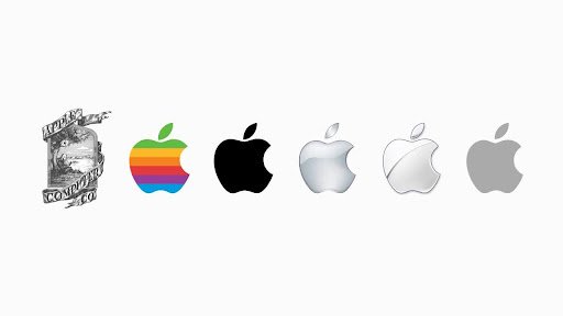
Think about Apple’s first logo back in 1976. Most people don’t even realize that the original Apple logo looked like a vintage illustration from a science textbook. It showed Isaac Newton sitting under an apple tree, framed by a detailed banner. Beautiful? Sure. Practical? Not at all. Just one year later, the company swapped it for the now-famous bitten apple. The rainbow stripes added a playful vibe that said, “We’re colorful and creative.” As time passed, the rainbow gave way to sleek, monochrome versions. Today’s logo is just a simple silhouette in silver or black. No clutter, just unmistakable Apple.
Pepsi
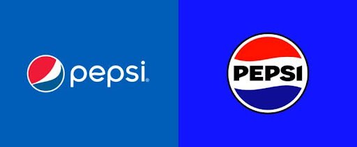
Pepsi is the king of tweaking its look. Over the years, its logo has shifted from old-school script to a modern, globe-like icon. The swirly cursive of the early 1900s was swapped for a bold bottle cap shape in the 1940s. By the 1970s, the red, white, and blue circle took center stage. In the 2000s, Pepsi gave the globe a more dynamic wave that feels energetic and fresh. Their 2023 refresh leaned back into the retro 70s wordmark, a nostalgic nod that delighted long-time fans. Pepsi proves you can keep the core identity while still feeling new.
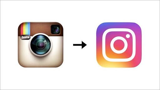
Remember when Instagram was just for vintage filters? Its first logo matched that vibe perfectly, a realistic retro camera icon that looked like a Polaroid knockoff. When Instagram exploded in popularity, that tiny camera didn’t translate well on phone screens. The company took a bold leap and replaced it with a simple, bright gradient background with a minimalist camera outline. It felt shocking at first, but the clean look pops beautifully on mobile apps. Now, it’s one of the most recognizable icons on our phones.
Other fun examples
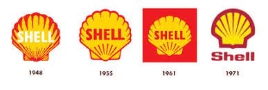
Think about Shell’s logo, originally a realistic seashell sketch. Over the years, it evolved into a bold, bright yellow shell that stands out at gas stations around the world. Or look at Nike’s Swoosh, which has stayed almost exactly the same since 1971. Sometimes, a logo is so strong it barely needs to change.
These examples show there’s no one-size-fits-all rule. Some brands completely reinvent themselves every few decades. Others stick to subtle refinements. Either way, smart brands know their logo needs to grow along with them.
The Risks of Changing a Beloved Logo
It sounds simple: update your logo, look modern, make people fall in love with your brand all over again. But reality often proves it’s not so easy. A logo is not just a piece of art; it’s a symbol wrapped in memories, feelings, and customer loyalty.
When brands get a redesign wrong, people notice. Sometimes they notice a lot.
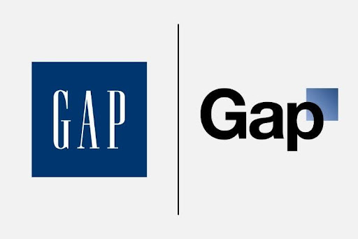
Gap’s legendary fail:
In 2010, Gap tried to replace its timeless blue box logo with a generic-looking wordmark in a plain font. They even added a tiny blue square floating awkwardly above the ‘p’. The backlash was immediate. Fans flooded social media, mocking the design and demanding the old logo back. Gap panicked, apologized, and switched back within six days. The cost? A bruised reputation and wasted money.
Tropicana’s juice fiasco:
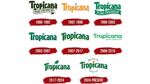
In 2009, Tropicana decided its classic orange-with-a-straw image was too old-fashioned. The new packaging showed a glass of orange juice instead. Shoppers didn’t recognize it on the shelves. Confused customers skipped over it completely. Sales dropped by an eye-watering 20 percent, costing Tropicana millions before they reverted to the familiar image.
Yahoo’s awkward rebrand:
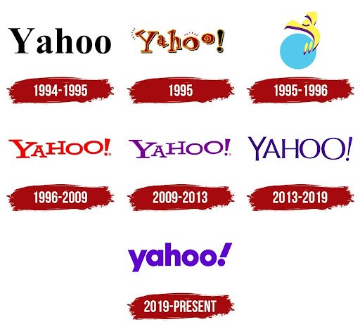
When Yahoo changed its logo in 2013, the redesign felt rushed and uninspired. Many felt it lost the playful personality that once made Yahoo unique. It didn’t help that the brand itself was losing its place in the tech world, so the logo change became another reason for people to feel disconnected.
What do these examples teach us? A logo isn’t just an ornament to swap out when bored. It’s part of your brand’s emotional bond with customers. If you strip away what people love about it, they’ll let you know.
A redesign can be powerful if done with care. The key is understanding what parts people treasure and what elements feel outdated. Brands that succeed at evolving their logo know how to modernize without throwing away years of trust and recognition.
Trends Shaping the Future of Logos
So, what’s next for logo design? A few trends are gaining momentum:
- Responsive logos: Flexible designs that adapt to different screens and sizes. Think of variable icons that simplify or expand.
- Motion logos: Subtle animations that bring a static image to life. Perfect for videos and apps.
- Hand-drawn vibes: Brands want to look authentic and personal. Expect more sketchy, organic designs.
- Throwback nostalgia: Retro is in. Many brands revive vintage versions of their logos to tap into feel-good memories.
These trends show one thing: while technology changes, the goal stays the same: to connect with people instantly.
The Psychology Behind Logos: Why They Work
Logos work because they’re shortcuts for our brains. Colors, shapes, and fonts trigger feelings faster than words ever could.
- Colors: Red feels bold and exciting (hello, Coca-Cola). Blue suggests trust and calm (think Facebook). Green? Fresh and eco-friendly.
- Shapes: Circles feel friendly. Squares and lines look sturdy and reliable.
- Typography: Playful script? Casual and fun. Bold sans-serif? Modern and confident.
A good designer knows how to blend all these elements into something that sticks. That’s the magic of logo design.
How to Know If Your Logo Needs a Refresh
If you run a business, how do you know when it’s time for a makeover? Here are a few signs:
- It looks dated: Does your logo scream 2002? Time to update.
- It’s too complex: Tiny details might vanish on mobile screens.
- It doesn’t reflect your brand anymore: Maybe you’ve expanded or changed direction.
- Competitors look fresher: Don’t let your brand get lost in the past.
A refresh doesn’t mean tossing everything out. Sometimes a small tweak, new colors, modern font, can work wonders.
Tips for a Successful Logo Redesign
Thinking about updating your logo? Keep these tips in mind:
- Know your audience: What do your customers love about your current logo?
- Keep it simple: A clean design is timeless.
- Test before you launch: Get feedback from real customers.
- Think digital-first: Will it work as a tiny app icon? On a website? On merch?
- Don’t follow trends blindly: Trends come and go, but your logo should last.
When in doubt, work with a skilled designer who understands your brand’s soul.
Conclusion: A Good Logo Never Stands Still
Logos are living symbols. They aren’t just drawings on packaging or websites; they’re tiny ambassadors that tell the world who you are, what you stand for, and why people should remember you. From ancient marks on clay pots to sleek digital icons on your phone, logos have always evolved alongside people, culture, and technology.
The biggest takeaway? Change is healthy, but it has to be thoughtful. The brands we admire most don’t change for the sake of change; they refine, refresh, and sometimes reinvent while keeping the heart of their story alive. When done right, a new logo can spark excitement, attract fresh fans, and remind loyal customers why they fell in love in the first place.
So whether you’re running a local bakery, launching a startup, or managing a global brand, treat your logo as a living part of your business. Keep an eye on how the world is changing. Listen to your audience. And when it’s time for a new look, don’t be afraid to evolve, just make sure you take your story with you.
In the end, the best logos do more than look good. They stick with us. They make us feel something. And they remind us, every time we see them, of the people and ideas behind the brand.
So here’s to logos…past, present, and future. Long may they change, inspire, and help brands stay unforgettable.