1. Minimalist Design
Minimalism is a design style that emphasizes simplicity and the removal of superfluous elements in a design, stripping it full to its basic elements, badge, shapes and textures. This style was rarely seen in the early days of the internet, but now it is really popular in internet design.
Benefits are this reduced loading times, Atmosphere of sophistication, Increased legibility, Emphasis on content, especially visuals
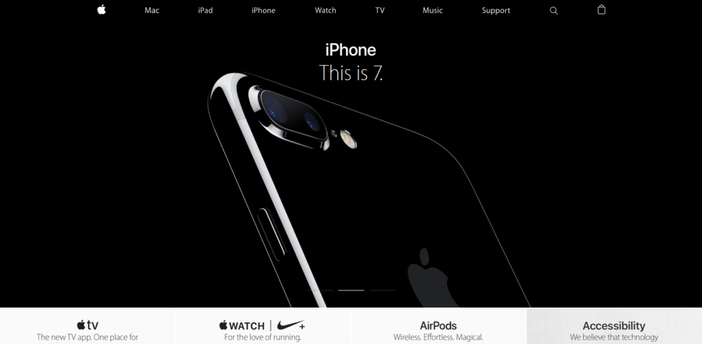
Photo credit: Apple
2. Material & Flat Design Hybrid
Material design is Google’s simple layered design language. Flat design is a simple alternative to skeuomorphism developed to facilitate early mobile devices. Flat design is a minimalist UI design genre which is currently used in graphical user interfaces for apps and websites. The style is aimed to create a 2D (or flat) image by not using any stylistic elements like shadows or gradients.
Material Design are creeping out of the realm of Android devices and are popping up everywhere & has a neat, clean and highly-usable charm Websites featuring.
Benefits are Modern visual aesthetic, Realistic mechanics make the UI feel intuitive and life-like, Material’s mobile-centric approach makes desktop browsing feel quick and effortless.
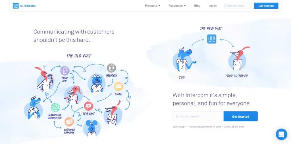
Photo credit: Intercom
Consider Material Design Lite for Websites
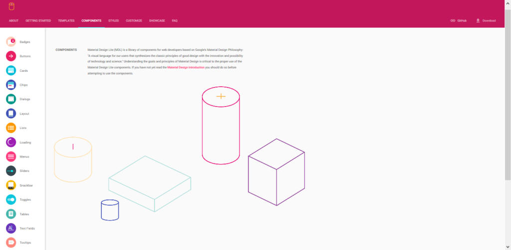
Photo credit: Material Design Lite
3. Rich animations
Animations are being used more and more to enhance a site’s storytelling, making the experience more interactive and entertaining. Animation ranges in scale, from a tiny, intricate spinning software to a full-blown, exciting illustration in the forward or background.
Benefits are action attracts attention to specific elements creates a more lively, engaging experience than just static images & Smoother visual feedback.
For the best practices – Navigation style

4. Cards
Coming from known the efficiency of cards long before digital design (think business greeting cards, playing cards, and so forth ). The idea is that all the most relevant information in regards to a single topic is structured into a single container.
There are social sites like Pinterest, Facebook, and Twitter, today the influence of cards is spreading out across multiple industries.
Their benefits are Easier to share content across social channels, Allow sites to organize a large amount of content into digestible pieces. Especially useful for sites with user-generated content, like social media, Perfect for responsive design. Card layouts can easily reorganize themselves to fit different breakpoints
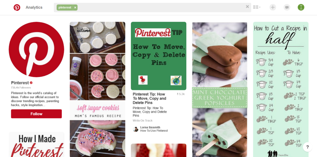 Photo credit: Pinterest
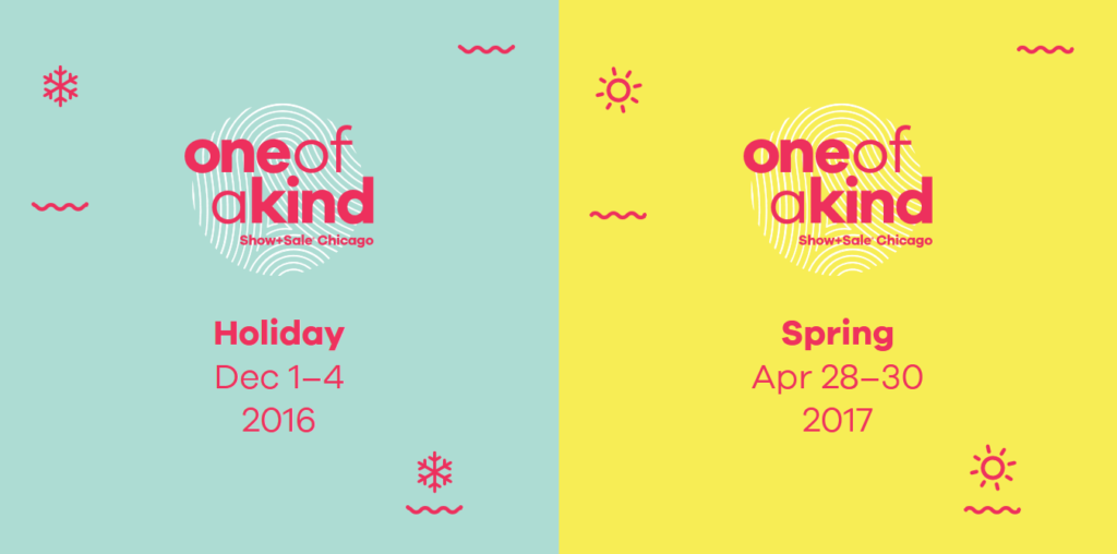 Photo credit: One of a Kind Show Chicago
5. Remarkable Typography
Better device resolutions, faster internet speeds, and the supply of recent web type tools (Google Fonts, Clayish Typekit, and so out ) make this the golden age of typography.
Benefits are Opportunity to display brand identity, Enhances the text content, A tool for visual hierarchy, especially useful for CTAs etc.
Overlaid Handwriting Typefaces
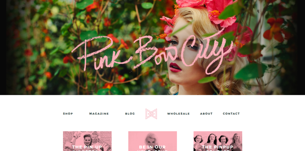 Photo credit: Pink Bow City
Simple typography is easier to read and better for loading, not to mention a necessity for minimalist styles. Consider these tips are increasing typeface size Contrasting its color to the surroundings, literally adding a bold style.
6. Illustrations
An illustration is a commonly used graphic design property in website designs, Illustrative websites have a promising future as the SVG (Scalable Vector Graphics) is getting popular. once the SVG is implemented we can use vector directly into the websites.
For the Practices add creative effects, Consistent theme with other elements
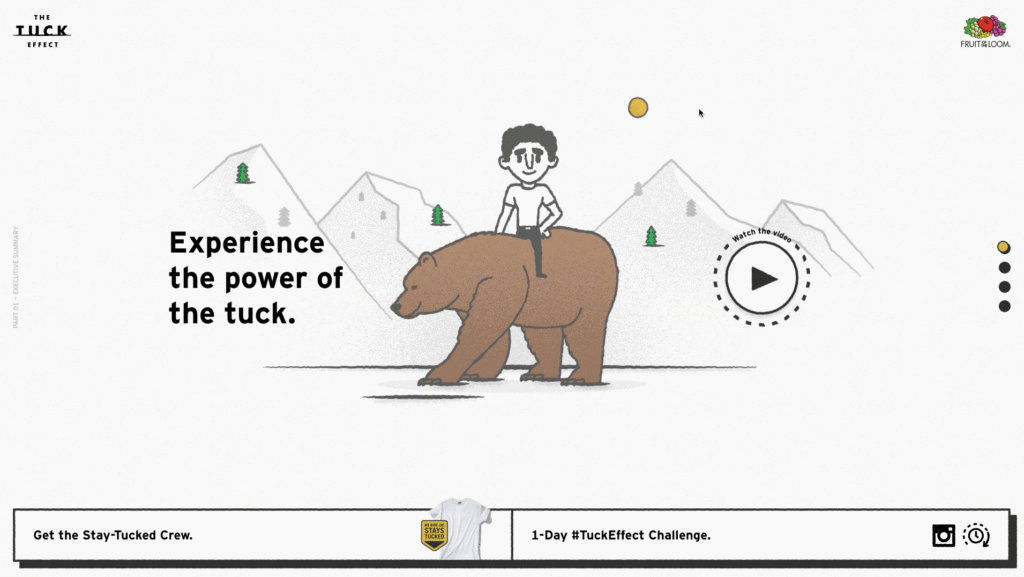 Photo credit: Tuck Effect
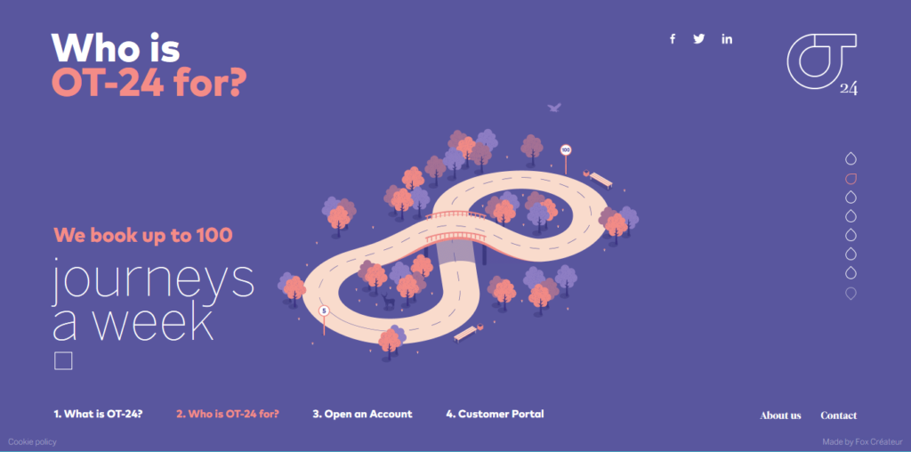
Treat as an Extension of Flat Design
7. More Vibrant Colors
All through 2015, we saw the pattern of brilliant hues, and in 2016 we’re seeing them taken to the following level. Expect much more dynamic hues — and a greater amount of them in bigger palettes.
Always use simple photos with a single, clear subject. Busy photographs, such as panoramic landscapes, may be obscured. Contrasting colors make it easier to distinguish what’s in the photograph. Use crisp and focused pictures, with clear divides.
Color overlays enhance the impact of a photograph, and allow designers to modify the tone the interpretation.
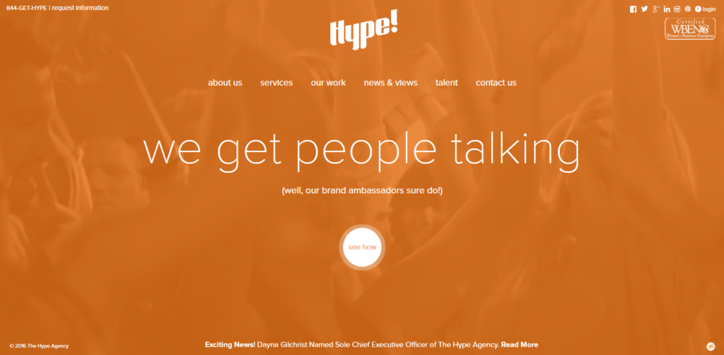 Photo credit: Hype Agency
Similarly, duotone is often used for overlays on top of photos, which we describe further below:
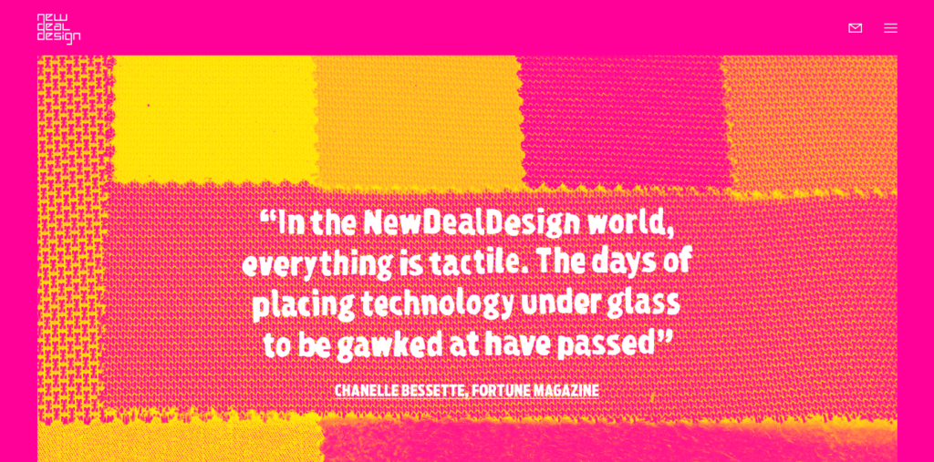 Photo credit: New Deal Design
We hope you have learned some of the techniques behind today’s most popular web design trends 2016 post.

